Hello and welcome to clusterofreds.com, my new snooker website!
After the end of last season, I had some thinking as to how I can improve my blog. There is a lot to improve. When I first started as a blogger, I put as little effort as possible in case if I don’t like it too much. Of course, I wanted to keep you lovely readers informed in terms of which bloggers to watch out for and which Youtubers to watch as regularly as I do now. I do put in a lot of effort to an extent where it is informative. But I felt that I really want to see how far this blog can go!

I changed from WordPress.com to WordPress.org to gain more independence in how I can run my website. This is the technical stuff as well as content (though there are some restrictions here and there.) So has much changed here?
The Changes
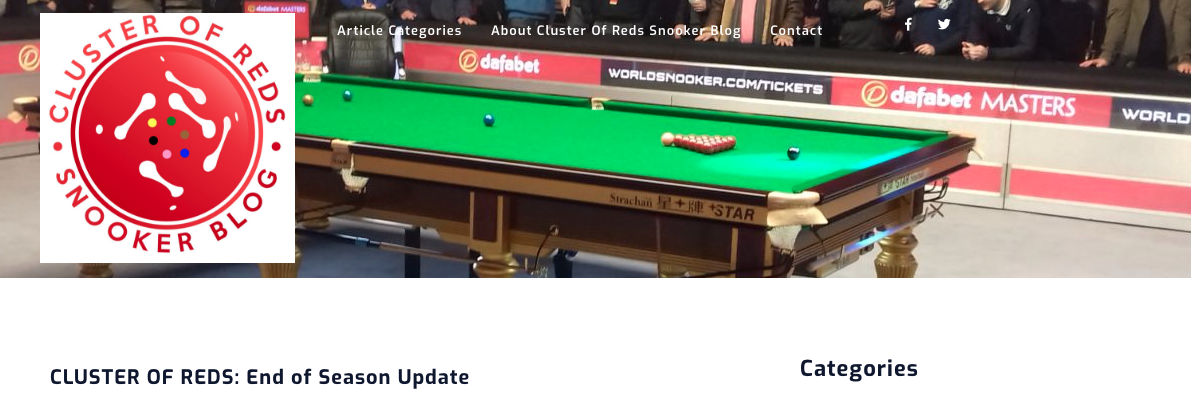
Sort of. The biggest change is the template and the website title. The template as well as the removal of ‘WordPress’ on my URL, means my website looks more professional and proper. This goes the same as the logo! It looks a lot better than the £15.00 one that I rashly bought from the Internet.
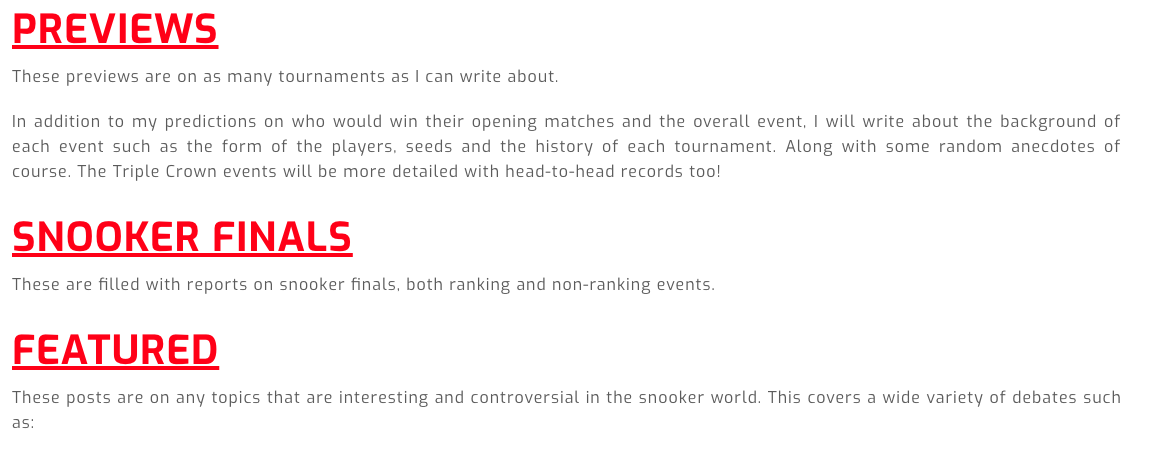
I had to replace the ‘Published Articles’ page I had where I noted down every single hyperlink. I created a much-needed plugin of categories called “Article Categories” (such as Countdowns, Featured and the Sisters Ain’t Doin It For Themselves Series!) Any relevant article is now more organised, ordered and neat so that it is more applicable to your needs.
For those who will click on www.clusterofredssnookerblog.wordpress.com, you will be redirected to www.clusterofreds.com. There will be more tweaks in the coming weeks but I want to make sure this is as complete as I can so I publish Riga Masters and World Open previews, as well as the “One To Watch” article like last time.
Hope you like it, take a gander and I honestly cannot wait for the new season!
